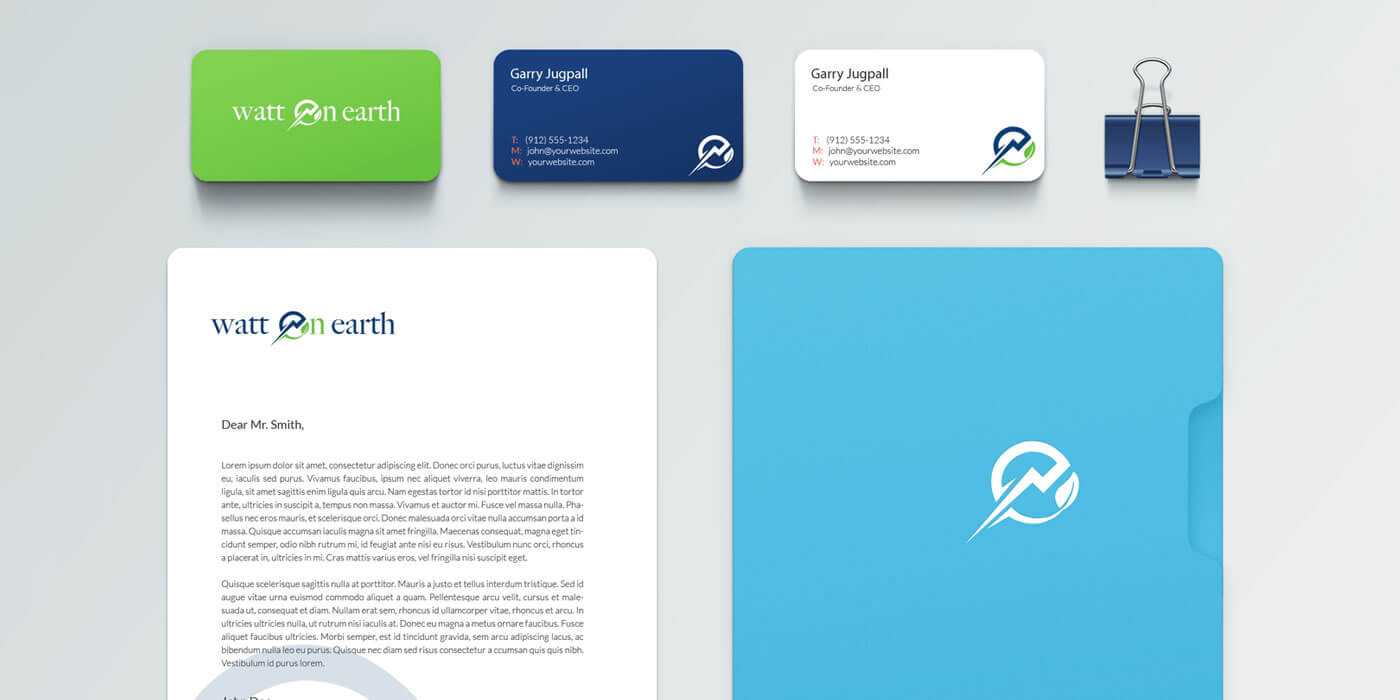
Watt on Earth
The proactive and encouraging attitude of Own The Day was carried through the visual design. Influencing the bright color palette and playful typography, each element of the identity was designed to work in harmony, collectively presenting a fun, playful, and confident look and feel. While most bar brands use muted colors or complex graphics, we opted for a simple and straight-forward design language that utilizes a bright palette and a bold logo mark. The final logo mark was made to be playful and organic in structure.
After many rounds of concepts and explorations we landed on a very simple and flexible solution. We created a design system that reinforced the idea of people, public spaces and the interaction within the new community.

